GRAPHICS
Some clients hire me to wear a few hats. This is a non-functioning UI I created for a plausible, but fictitious, suite of tools intended for healthcare providers and their patients. It was used to fill the screens of personal devices in a video I also art directed. May, 2017.
A commercial shoot involved a boxed flatscreen television - it was a hero prop, and thus it needed to be camera-safe and generic, which meant redesigning realistic packaging from scratch. I created the design and had TAP Design Group output it on a permanent luster vinyl, which we wrapped a real box with. The final product looked - if I do say so myself - pretty great, and because I used one of my own photos from Switzerland as the image on the television, the whole prop is commercial-use and royalty-free. December, 2016.
While scouting locations for a series of commercials for Barclaycard with a colleague, Jon Chaifetz, it became evident that we needed a substantial amount of quick graphic work and fake branding. One of the spots was shooting in a concession stand, and we would have to generate stickers or signage to cover all existing branding and logos...of which there were several. It's not quite as direct as inventing a fun name and using a goofy font, however.
Each fake brand - even the silly ones - needs to be researched to make absolutely sure I'm not accidentally infringing on any copyrights that already exist. The upside, of course, is that I now have the market cornered on SQUENCH. December, 2016.
Had to cover all that extremely proprietary branding on the fountain soda taps, so I created some fictitious fountain sodas of my own. Also needed some simple signage for the appliances within the stand itself.
And of course the cooler should really be filled with drinks. MORE SQUENCH.
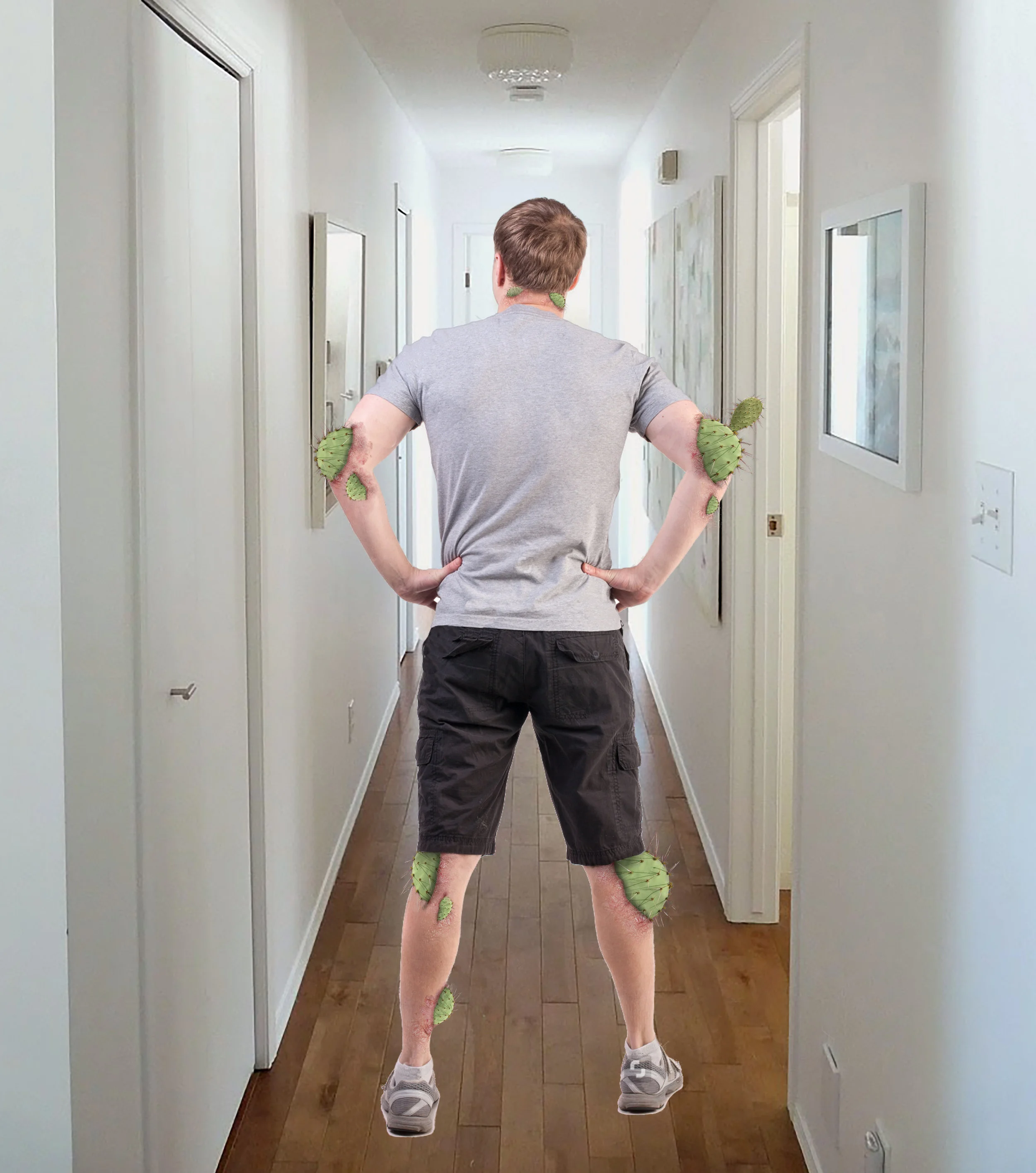
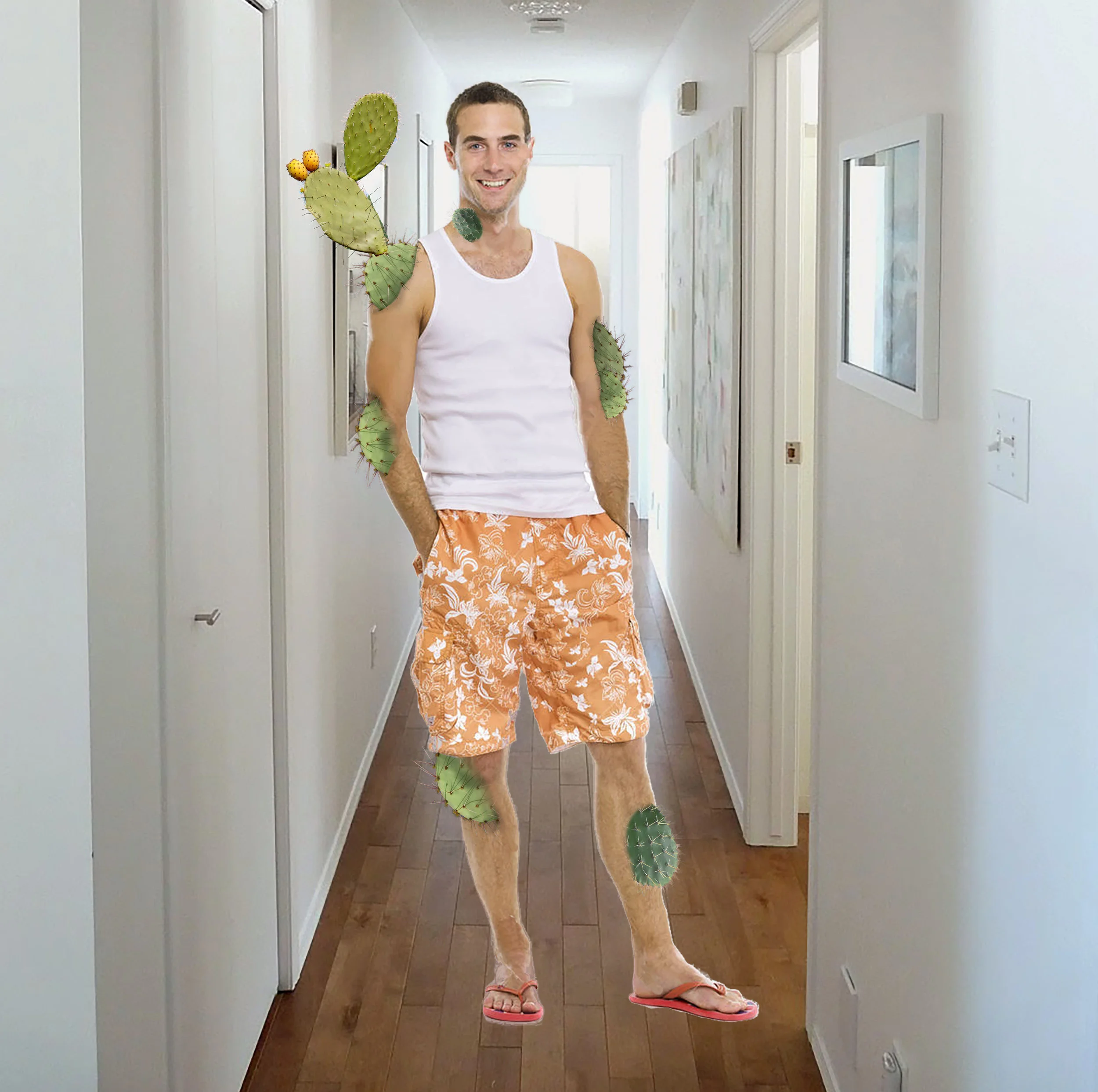
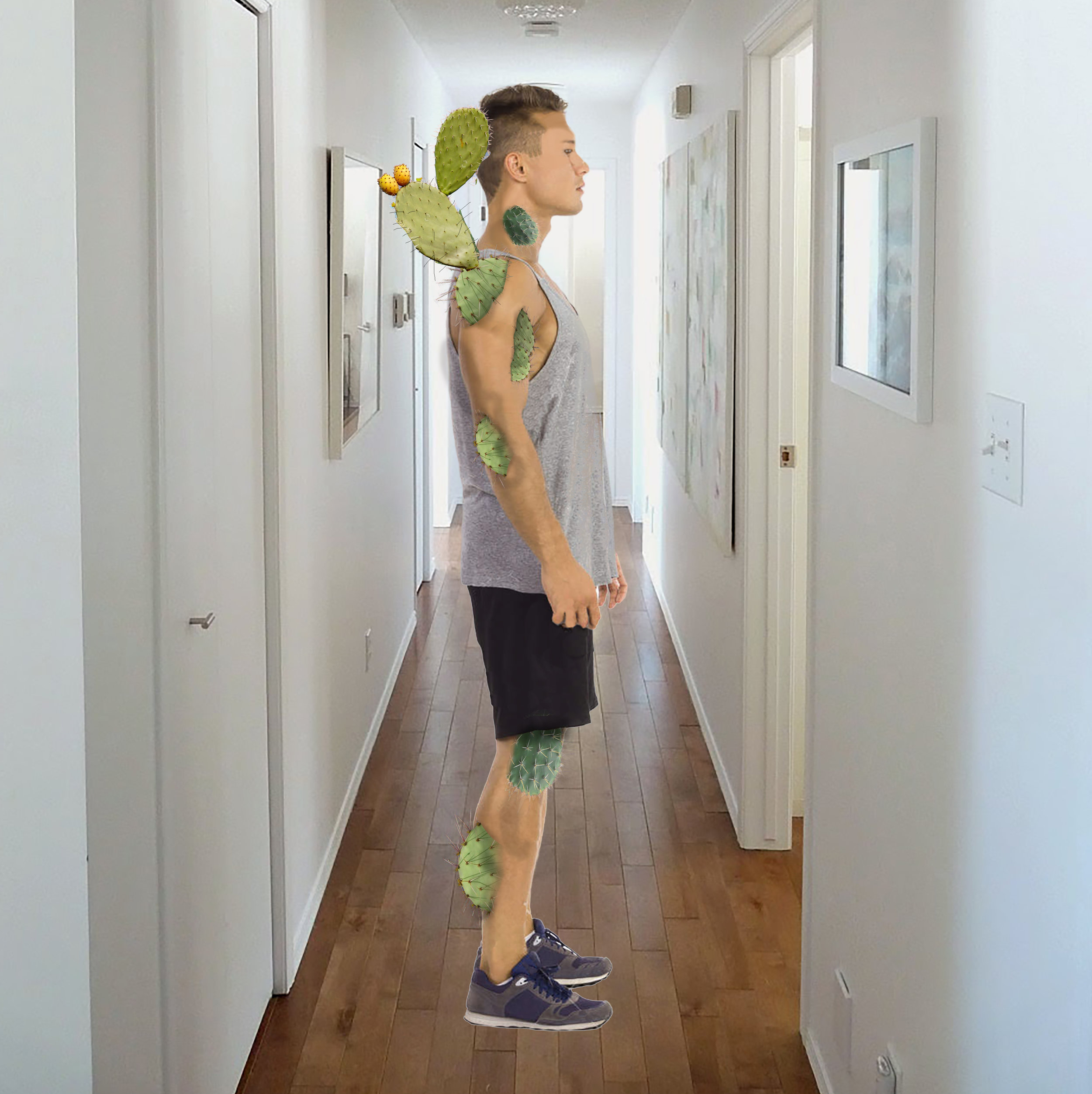
I was hired to create some renderings for a commercial illustrating the sensations and effects of psoriasis. The final product was to be an actor riddled with prosthetic cactus patches protruding from his skin that scratch and destroy the environment around him. I only had about a day to turn these out, but being able to visualize the prosthetic pieces ahead of time was key to getting sfx, makeup, the director and the client all having the same conversation -- and it streamlined discussion and approval of design, placement, sizing, and color. May, 2016
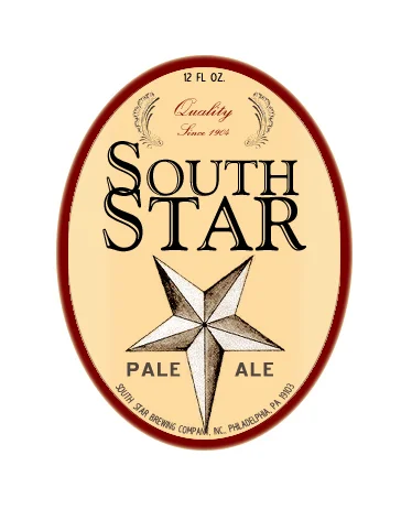
More often than not, graphics I create for production are the simplest and most cost-effective way of dealing with copyrights and branding. We need to shoot a record going onto a record player, but someone, somewhere owns the artwork, the record label logo, the song names, and the artist's persona. I do whatever research is required to make sure my fake designs are unimpeachable, and usually output replacement labels onto a camera-friendly soft gloss stock.
Straightforward pro-bono branding created for an organization in Florida. April, 2015


